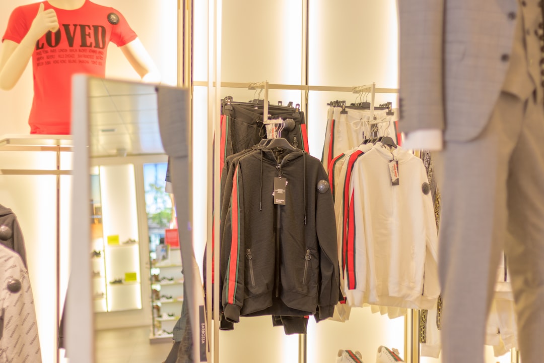
The Psychology of Color in Retail: How it Influences Buying Decisions
Color is a powerful tool that can evoke emotions, influence moods, and even drive purchasing decisions. In the world of retail, understanding the psychology of color can be the key to success. Whether it’s the color of a store’s logo, the product packaging, or the overall store design, each color choice has a psychological impact on customers.
Red, for example, is a color often associated with passion, excitement, and energy. In retail, it is often used to create a sense of urgency, thus increasing impulse purchases. This is why many clearance sales signs are red, as it signifies a limited-time offer. Additionally, red can also stimulate appetite, making it a popular choice for restaurants and food retailers.
On the other end of the spectrum, blue is often associated with calmness, trust, and reliability. It is a color that is frequently used in the financial sector to instill a sense of security and professionalism. Many banks and insurance companies incorporate blue into their logos and branding to create a reassuring atmosphere. Blue is also considered a versatile color and is often used in fashion retail to create a sense of sophistication and elegance.
Yellow, the color of sunshine, is associated with feelings of happiness, warmth, and optimism. It is often used to grab attention and create a sense of excitement. This makes it a popular choice for retailers who want to draw customers in, especially during sales events and promotions. However, it is important to use yellow sparingly, as too much of it can be overwhelming and create feelings of anxiety.
Green, the color of nature and tranquility, is often associated with health, wealth, and eco-friendliness. It is frequently used in stores that sell natural or organic products to convey a sense of sustainability. Green is also known to have a calming effect on customers, making it an excellent choice for stores that want to create a peaceful shopping experience. Many retailers use green to promote environmentally friendly initiatives and products.
Black, a color often associated with luxury, sophistication, and power, is commonly used in high-end retail. It is a color that exudes elegance and can enhance the perception of luxury and exclusivity. Many luxury brands incorporate black into their branding to convey a sense of prestige. However, it is important to use black strategically, as too much of it can create a dark and gloomy atmosphere, deterring customers.
In addition to individual colors, the combination of colors in a retail space is also crucial. Color schemes must be carefully selected to create harmony and evoke the desired emotions. Warm colors, such as red, orange, and yellow, can create a sense of energy and excitement. Cooler colors, such as blue, green, and purple, can create a more relaxing and soothing environment.
It is important to note that the psychology of color can be subjective, as cultural and personal experiences can influence individuals’ perceptions. For example, while white is often associated with purity and cleanliness in Western cultures, it may be associated with mourning and loss in some Eastern cultures. Thus, it is crucial for retailers to take into account their target audience and cultural context when selecting color schemes.
Overall, the psychology of color in retail is a powerful tool that can have a significant impact on buying decisions. Understanding the psychological effects of different colors and how they interact with each other allows retailers to create an environment that attracts customers, promotes desired emotions, and ultimately drives sales. By carefully considering color choices, retail businesses can enhance the shopping experience and leave a lasting impression on customers.
